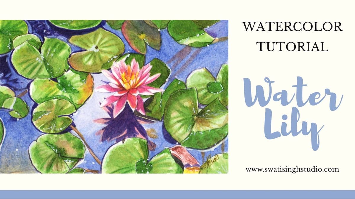
Hello, my lovely artists!
August is here already. The year 2020 is so unusual and chaotic all around the world. I pray that you all stay blessed for the rest of the year.
Water lilies or lotus as you may say are such a beautiful looking flower. There are so many poems written on this wonder.
These beautiful fragrant flowers grow in mud water and have been an inspiration to mankind for so long.
“Every struggle is like mud- there are always some lotus seeds waiting to sprout.” - Amit Ray
These delicate flowers also provide habitat to fish and wildlife. Such a pretty home to live in right!
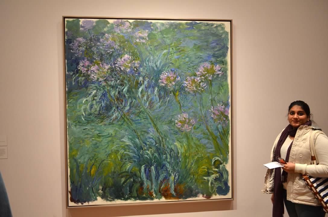
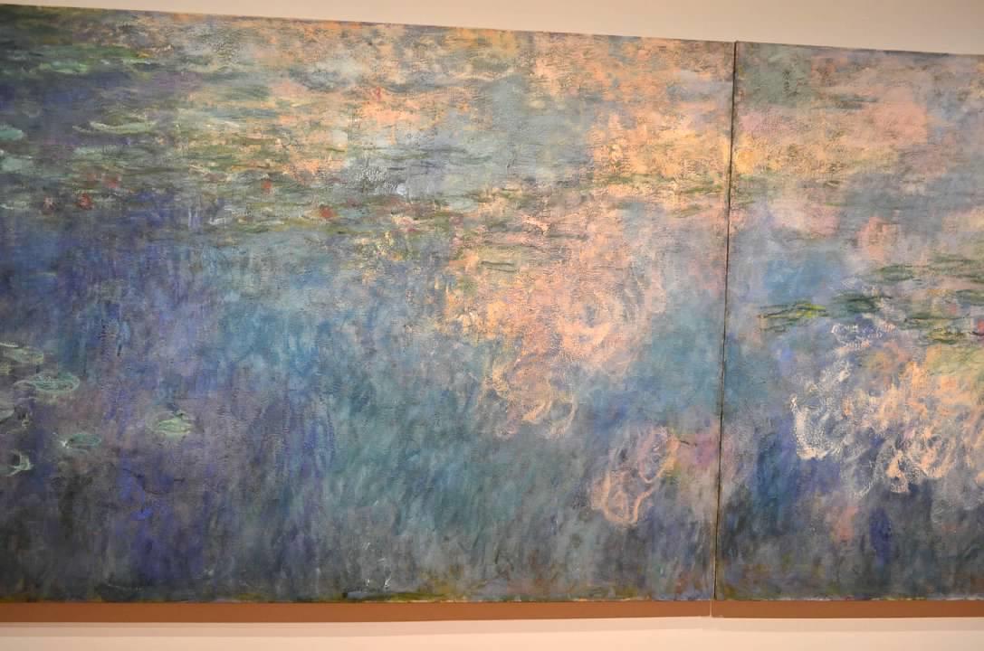
One of the most famous paintings ever painted on this subject is by Claude Monet. Luckily, I had a chance to see some of his magnificent work up close during a visit to MOMA in New York a few years back. I loved the Agapanthus so much I could stay there all day long!
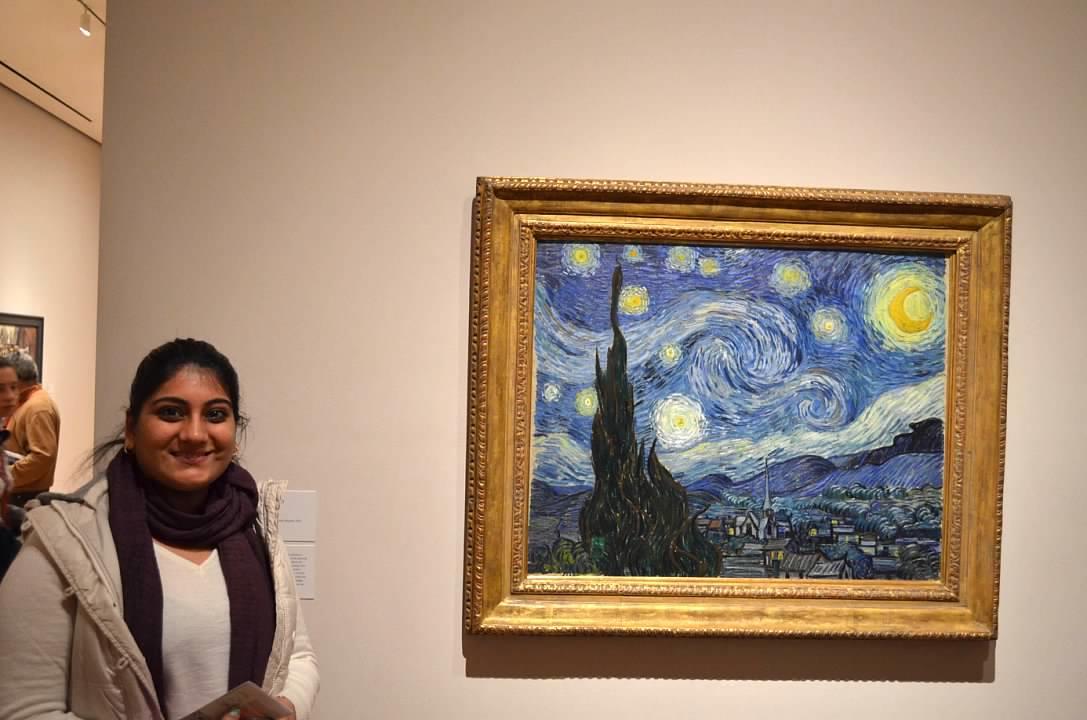
And of course, I was lucky enough to see Starry Night by Vincent Van Gogh!
REFERENCE IMAGE
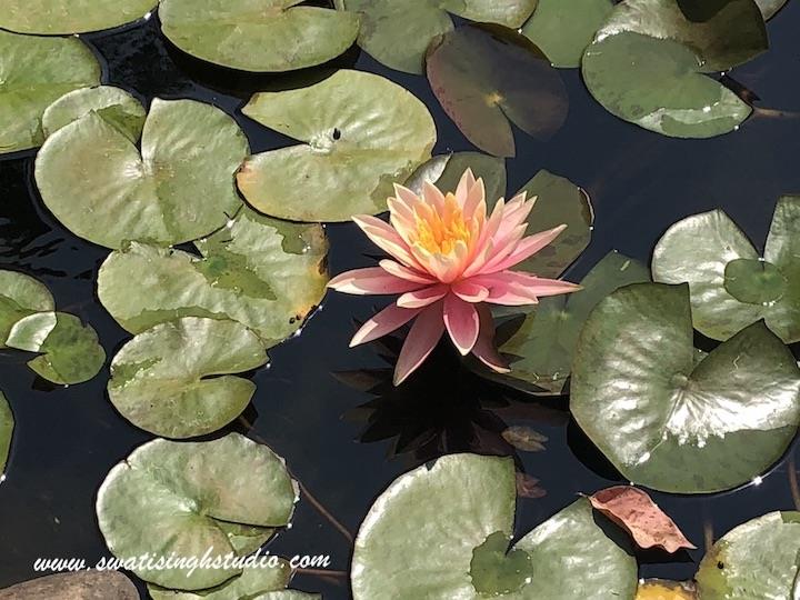
I captured these pink lilies on a trip to Mahabaleshwar last year. Something about the still water and the sun rays shining over the petals inspired me to paint them.
THE COMPOSITION
The composition is a little challenging in the sense that we need to show the translucent pond in a way that we can see the stalks underneath but in a hazy way.
In the original photograph I took, you can see that the water is very dark. I did not want to paint it this dark green. So, to make the composition look more appealing I opted for a blue tone instead to suggest the reflection of the sky.
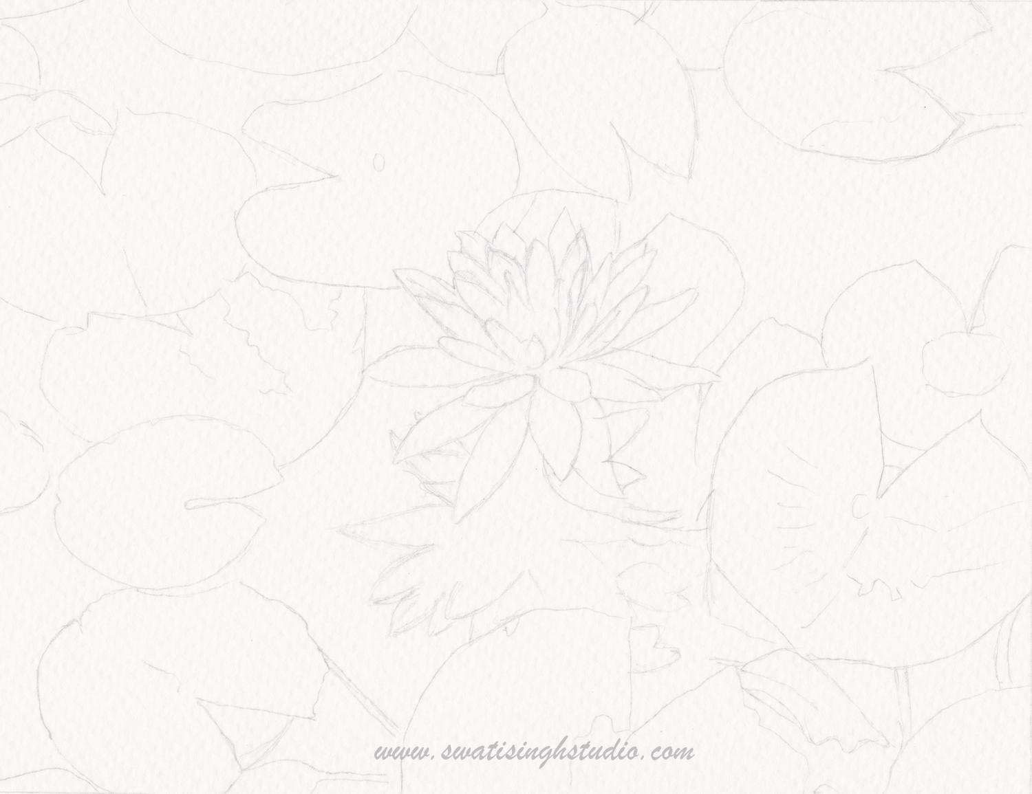
DRAWING
WATERCOLORS REQUIRED
1. Lemon Yellow
2. Sap green
3. Burnt Sienna
4. Ultramarine blue
5. Scarlet red/ Permanent Rose
6. Gamboge Yellow/ Cadmium yellow
7. Raw Umber
8. Orange
BRUSHES REQUIRED
# 3 round brush for lily pads and pond water
#1 or 0 round brush for fine details and lily petals
THE METHOD
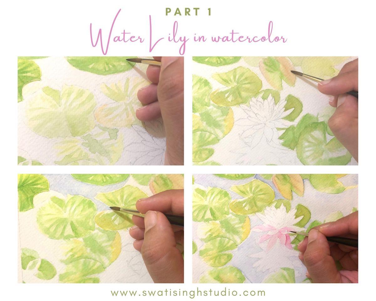
Step 1- Start by adding a glaze of clear water on the lily pads. And start adding lemon yellow. Make sure to leave out highlight areas.
Once you are done with lemon yellow start adding sap green. Make sure to keep it dilute enough since this is just a mapping stage and we will add up more layers on top later.
Step 2- In the areas where we see some brown marks and spots simply add in a touch of burnt sienna. Let everything dry.
Step 3- Now with all the lily pads mapped out in greens and yellows. It is time to move on to the water. Simply dilute ultramarine blue well. Apply this dilute ultramarine with a number 3 round brush carefully leaving out any highlights you see in the water.
Step 4- Now the star of the show- Pink lily. Apply a very pale layer of scarlet red which looks like a pink shade. It is a perfect shade for this lily. Make sure to use a size 0 or 1 brush for this since the petals are very tiny.
If you observe closely you will see that there are some strong highlights on the petals due to sunshine. We want to protect those areas at this stage.
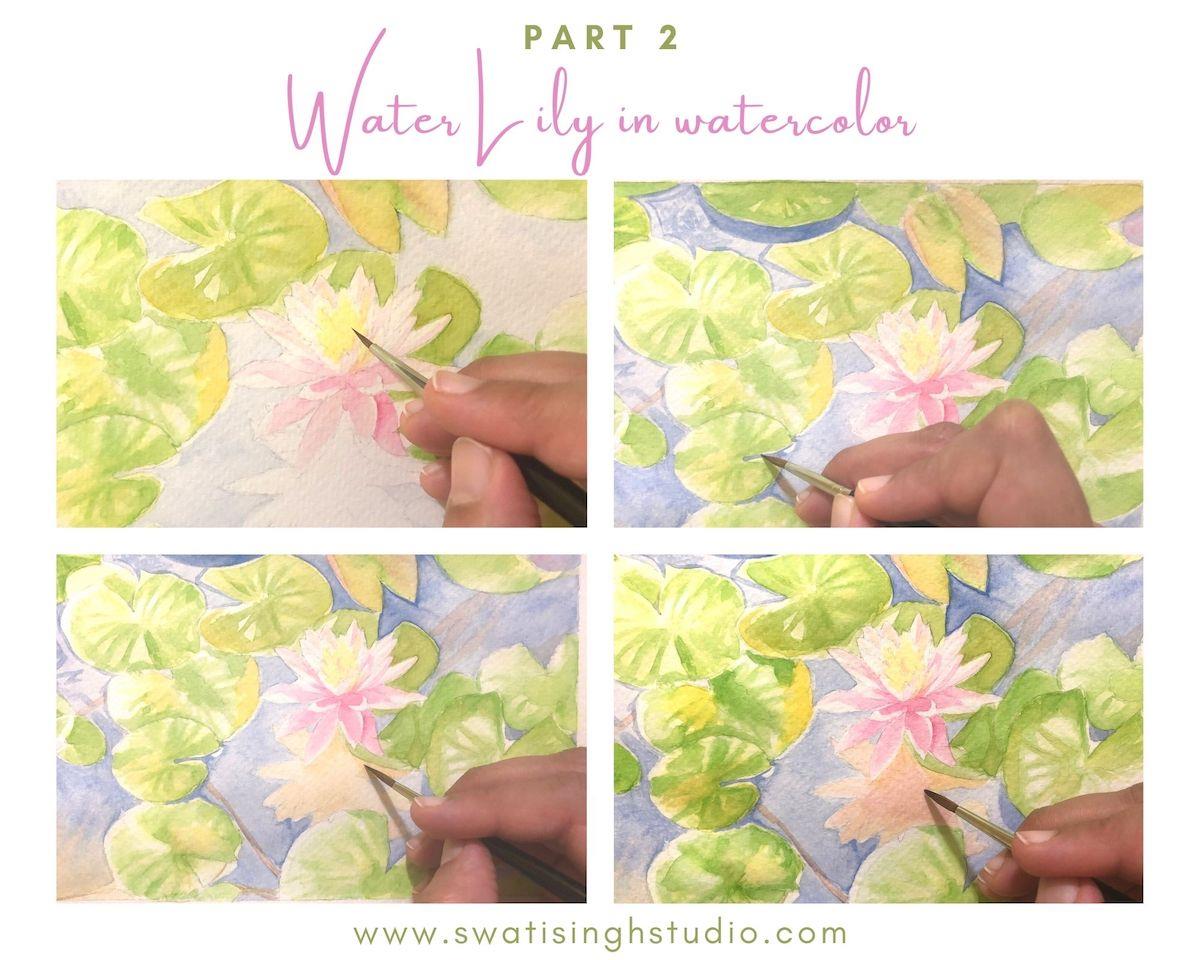
Step 5- The inside of the lily is rather orangish rather than pink. For the center apply some gamboge hue. You may also opt for cadmium yellow.
Step 6- In the water, you see some strong shadow lines around the leaves. Simply apply a more saturated ultramarine blue in this area. You may do this wet-on-dry.
Step 7- Just below the lily the shadow does not look pink at all. It looks more orangish because of the color of the water itself. Hence apply a very dilute layer of burnt sienna.
Important: Make sure it is dilute enough or else you will lose the transparent feel of the water.
Step 8- To make it look even prettier just add a slight amount of scarlet in the center. Keep it untouched towards the edge of the petals. Make sure to work wet-in-wet.
Tip: If you feel your burnt sienna layer has dried simply apply a layer of clear water before proceeding. It helps in getting a smooth transition between two colors.
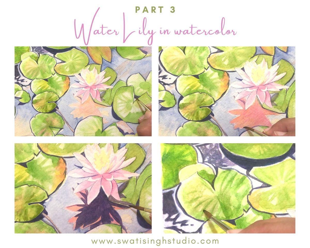
Step 9- We need to mix a stronger shadow blue for water. Mix some scarlet red and ultramarine blue to get a violet color. Apply this color with a very fine brush as shown in the image. Keep the color thick enough to get the right saturation.
Tip: If you feel you are not confident enough at this stage you may work it up in two layers instead. Just make sure that the previous layer is completely dry before you start applying the second one.
Step 10- Adding another layer of scarlet red on the lily shadow in the water.
Step 11- Once the previous layer has completely dried apply the same violet color we prepared earlier for the stronger shadows.
Step 12- Apply a second layer of green on lily pads. The sap green I have currently is student grade and it took me forever to apply. I had to overwork it with so many layers.
Also, you need to tone down some of the highlight areas. For that, you need to work with a dry brush technique. Simply take some sap green and mix it with raw umber to tone down that bright green color a bit.
Now pick just a tiny amount of color with almost a dry brush and start applying in the highlight area.
Tip: If you feel you have picked up a lot of color then simply dab it on a tissue before proceeding.
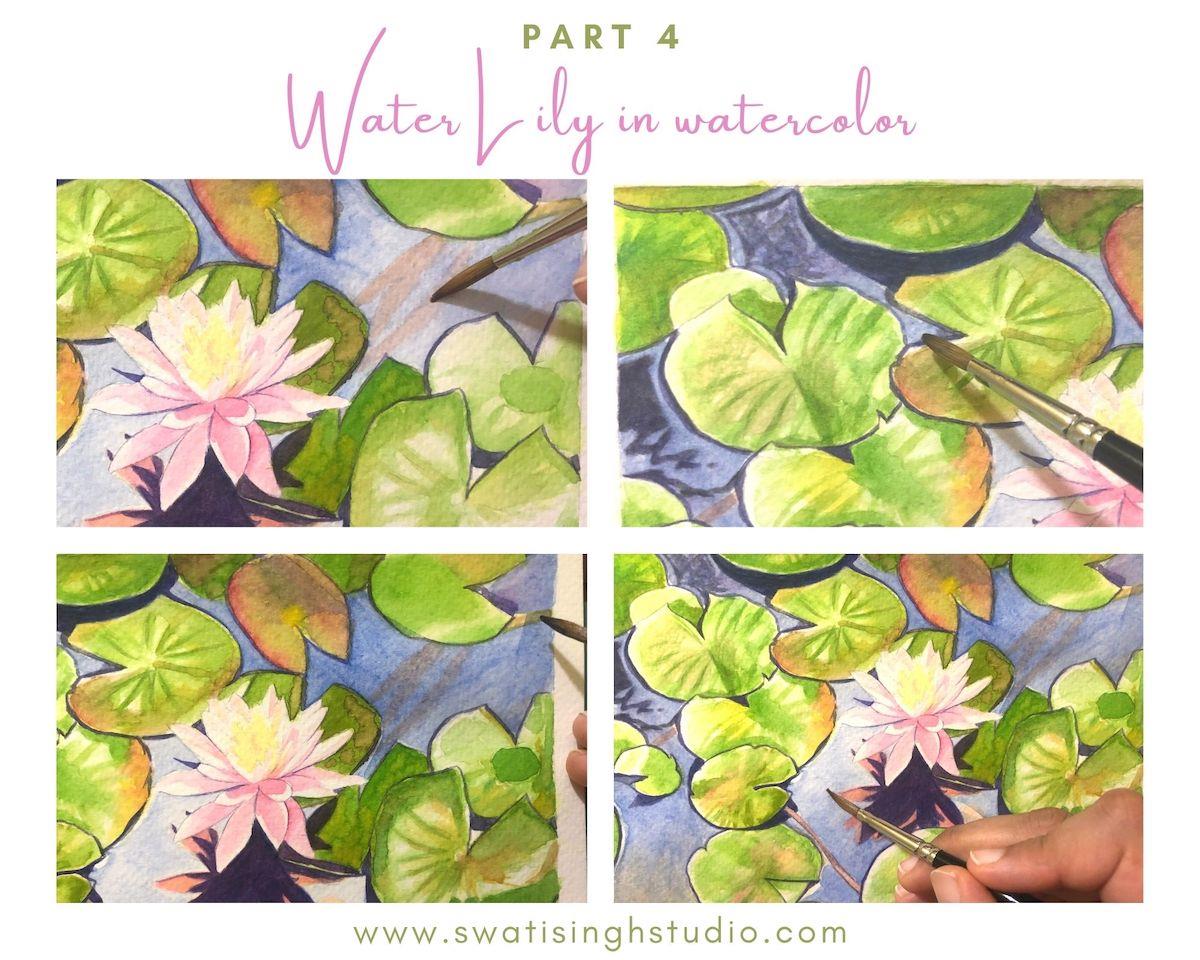
Step 13- Add some burnt sienna in the lily stalks. Keep it dilute since we do not see a lot of them due to dark water above. Just a suggestion of these stalks will make it look interesting.
Step 14- The violet shadow lines are completely dry by now. We need to deepen the color of the water some more.
So, take some dilute ultramarine blue again and carefully go over the shadow lines so as to not disturb the shadow lines underneath. I know this sounds very scary to do so but we need to practice this skill as well! Just go over it once. Do not overdo it. Once is enough.
Tip: If you feel that the layer was very light and you need to add some more color. Wait for it to dry completely or else you run a chance of mixing those carefully put violet lines blend in. A thick brush works wonders here since it can hold a lot of color and you can go over everything in one clean sweep.
Step 15- Look how I am going over the stalk in this area. The same color and going over the burnt sienna stalks make them look submerged in water!
Step 16- I did some gradation around the lily to keep it look interesting and make it the focal point of the painting. The water is dark below and gradually lightens towards the center. This makes the lily stand out and helps it become the focal point here.
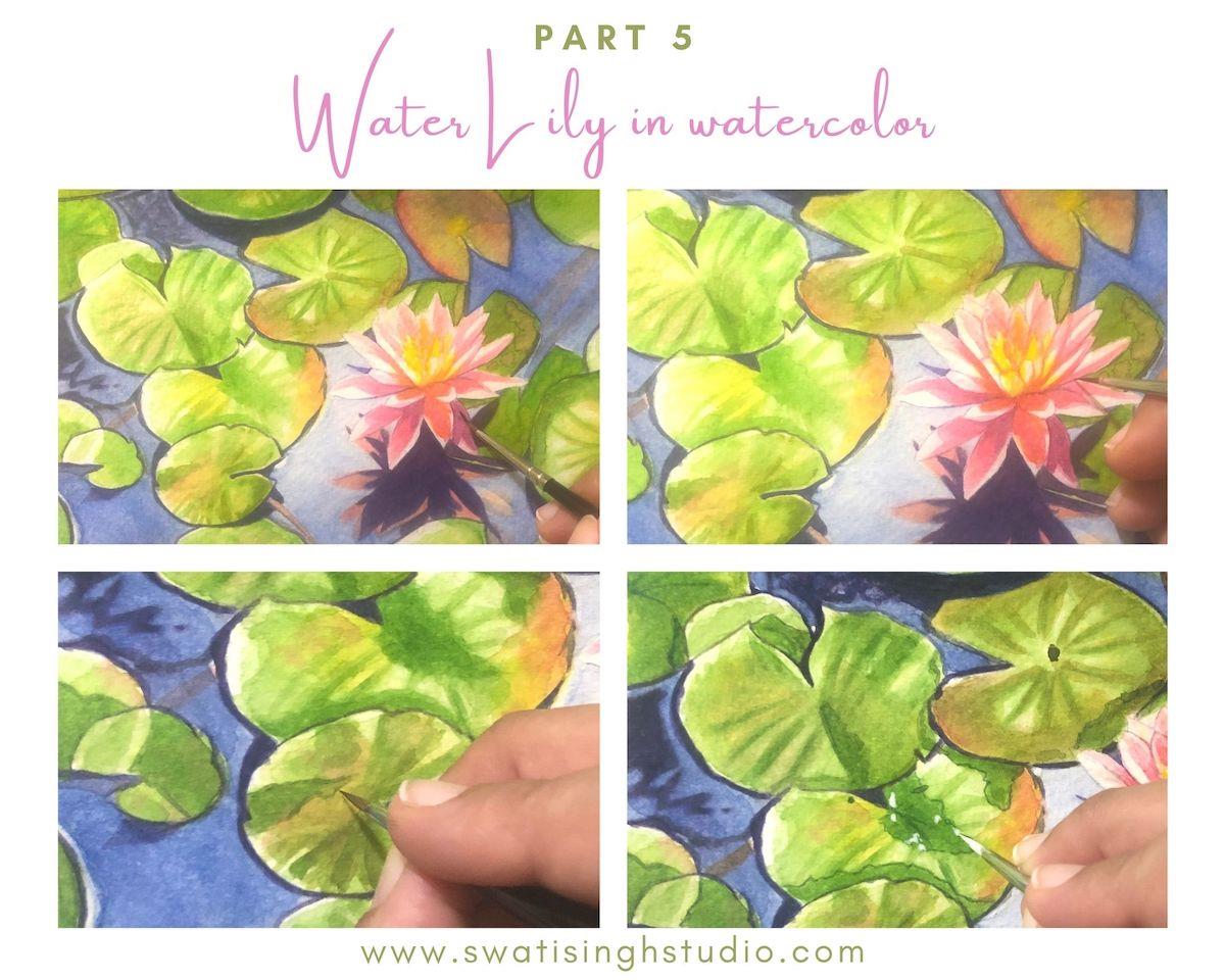
Step 17- The lowermost petals of the lily are very dark compared to the ones above. To make these petals recede we need to apply a very thin layer of ultramarine blue over them with a very fine brush. Also, add in a touch of orange on some of the petals. Since the color of the flower is not just true pink but rather a mix of some orange.
Step 18- Clean up the edges of the petals with some ultramarine blue. Be very careful while doing so. We do not need very bold lines. Just a hint of the edge. This step makes the individual petals stand out against each other.
Step 19- Going back to the petals. We do see some water over the lily pads. Now to make it look like water we need to take two steps. First with a fine brush outline the water with some sap green mixed with raw umber. Outlining it will make it look three dimensional.
Step 20- Now we need to add in some highlights over the water. Usually I am very careful around the highlights so that I do not require to put any white paint. But with art so small sometimes it is best to do it afterward. Hence, I added the white highlights in the end with a fine brush. This makes the water sparkle a bit! Which again helps in creating an illusion of water. You may also go over the highlights left in the pond area if you feel.
Simply scan the whole painting once for any fine details that need to be added on the leaves like marks of brown here and there and use burnt umber for the same. And we are done!
Art prints of Water Lilies are now available for purchase in Shop along with other merchandise!

Hope this tutorial inspired you to paint these beautiful blooms in watercolor.
I will be back with yet another tutorial soon. Till then stay safe and Happy Painting!
Swati