
Hello, my lovely artists!
How are you all doing? I am here with Part 3 of the series. Today we are going to tackle the background as well as the vase in the composition.
If you are new to the series you are welcome! Below are the links to the previous parts in the Daisy series!
THE COMPOSITION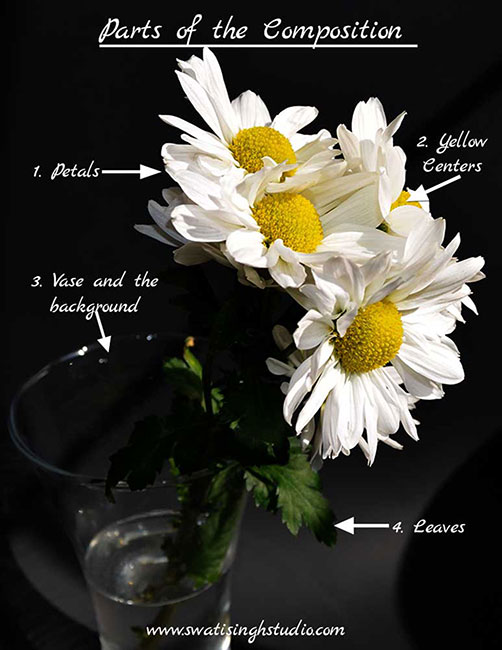
I chose to put both together in the same tutorial because they sort of fall in the same category in the composition. Since the vase is completely transparent we see all the background colors through it. The only difference is that where the background colors are bright and highly saturated the colors in the vase on the other side are a bit muted i.e. low in saturation and tonal value.
PLANNING THE BACKGROUND COLORS
In the picture the background is black but I decided to uplift the painting by using a purplish background.
Why Purple you may ask?
Well, what attracted me to paint these flowers in the first place were the interesting yellow centers of these flowers. I just loved everything about them. The color, the texture, the shape and the way they just pop right at you when you see the white flowers.
Hence, I decided to choose the complimentary color of yellow which is purple in the background. Complimentary colors look beautiful when placed next to each other or in other words they just complement each other!
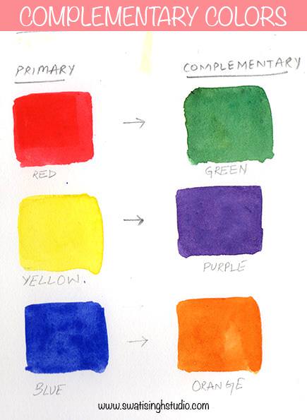
Believe it or not all this planning was done on paper even before I started drawing these flowers! The whole journey runs smoothly when you do just a little bit of planning beforehand. I knew exactly how I want the painting to look like in the end. Of course, you get new ideas to refine your work when you are in the painting mode but for the most part, I know where I am heading!
WATERCOLORS USED
We are using the same colors we used in Part 1 of the series where we created beautiful gray shades for the white petals.
1.Cobalt blue
2.Permanent rose
3.Lemon yellow
BRUSHES USED
#4 round brush
#1 round brush
OPTIONAL
Masking fluid- To protect petals from getting stained from all the dark background colors. This also fastens the whole process as we do not need to worry about going over the white areas accidentally. Although if you do not have a masking fluid you may just go around the petals carefully.
I also applied the masking fluid on the bright highlights of the vase and the leaves inside it.
PART A- BACKGROUND
RULE: There are no rules when it comes to painting a background! This is the part where you can showcase your creative side. This is where we have the most fun in the painting. Let the watercolors do their work.
Step 1. Once the masking fluid is completely dry mix all three colors together to prepare different shade of purple by simply varying the amounts of each color alternatively.
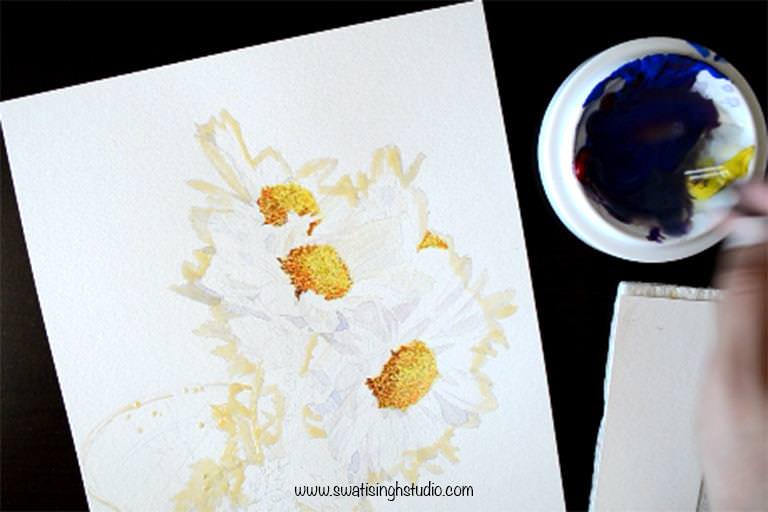
Note: Keep the consistency of the colors a bit thick to create a rich background. We don’t want to overwork the background by adding a lot of layers.
Step 2. Apply a light wash of water to help the colors mix together on paper. This will create a smooth texture.
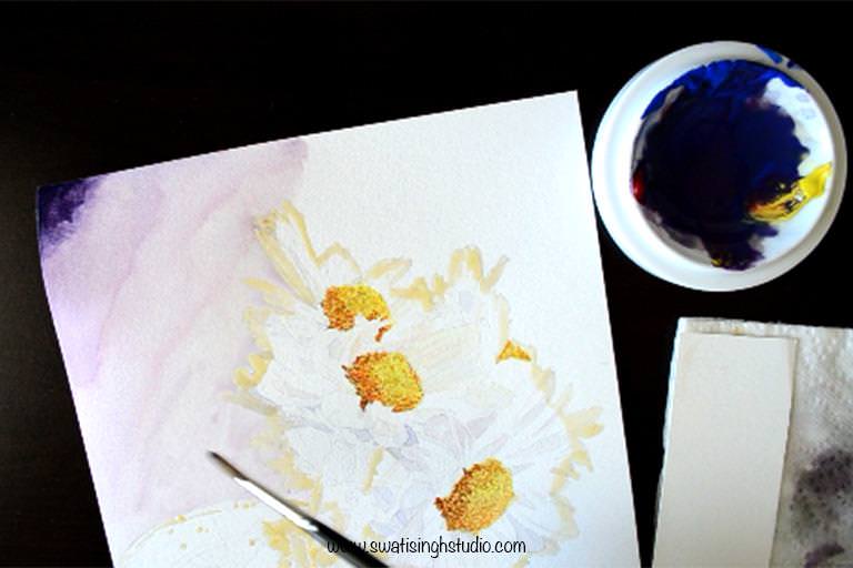
Step 3. Now start adding the colors in. I am using a #4 brush. Vary the shades as you go to create an interesting background!
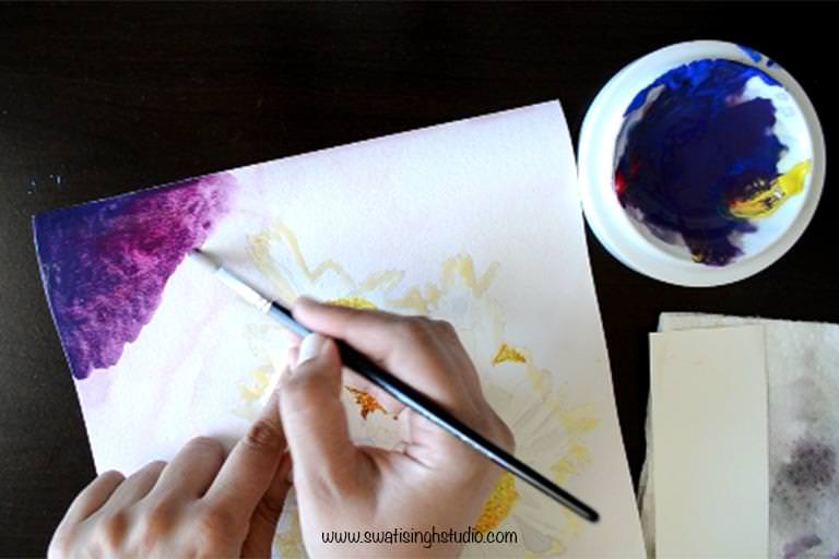
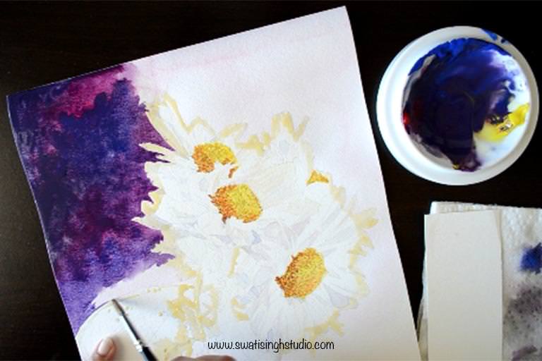
Note: Be careful around the rim of the vase. You may use a thin brush (#1) here.
Step 4. Switch to a fine brush (#1) for those little nooks around the petals.
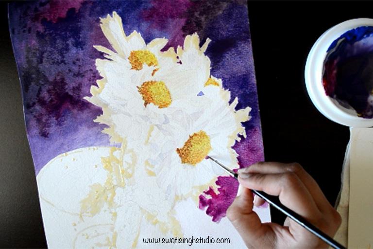
Step 5. If your sheet has dried reapply water to the bottom part and drop the colors.
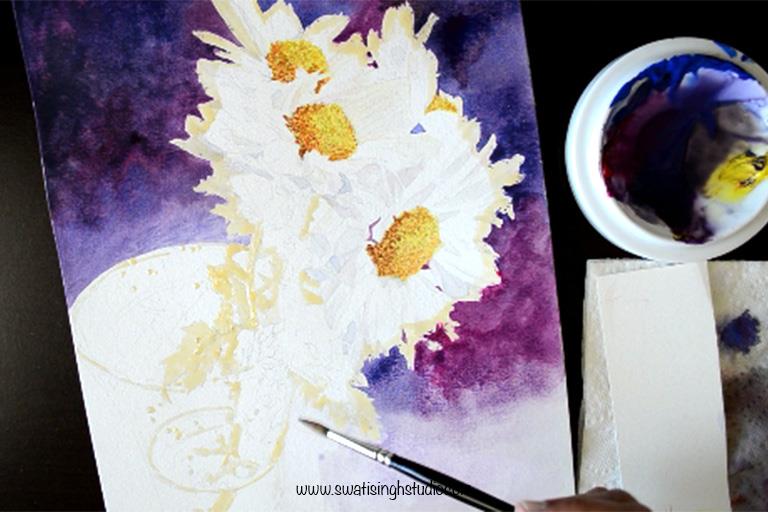
Step6. Finish the fine details with a #1 brush again.
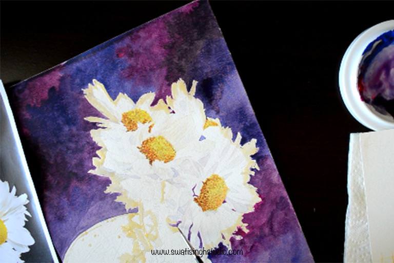
Step 7. Darken the background with a second layer of color wherever needed. And the background is done!
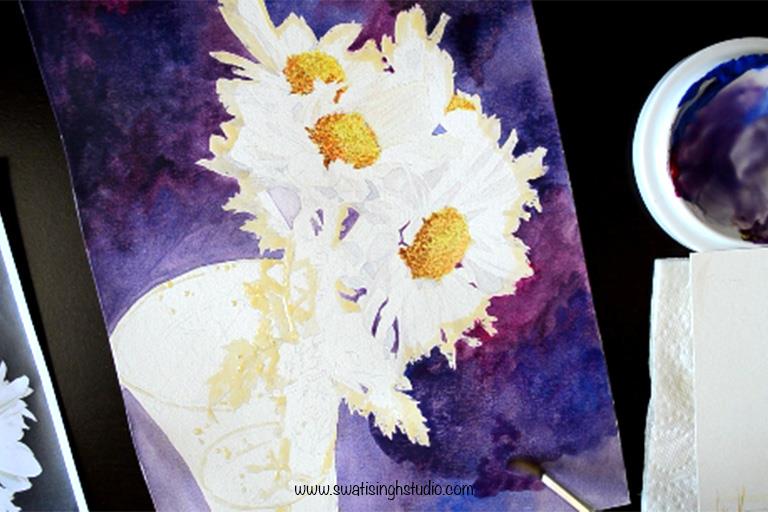
Important: Remember to go around the vase carefully.
PART B- VASE
Painting glass is very different from the background.
In the background, we did a very thick layer of color in just one or two layers.
But in the case of the vase, we will slowly build layers to create the transparent effect we are looking for.
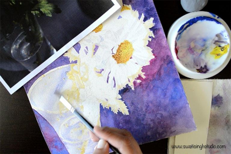
Step 1. Tone down any dark lines using an eraser and apply a wash of clear water to prep the sheet.
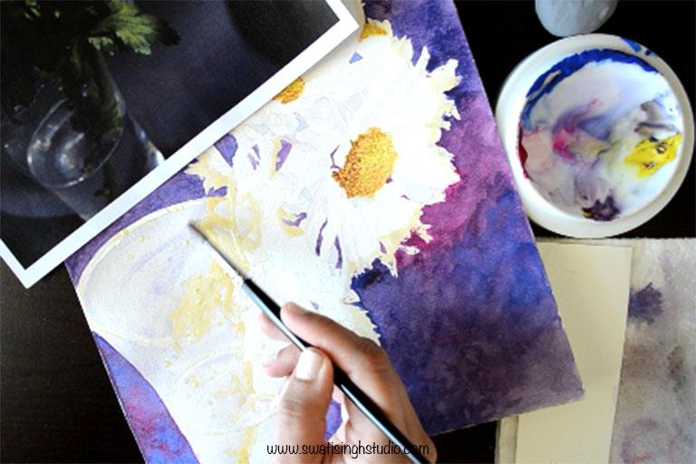
Step 2. Mix all three colors together to get a bluish gray color. To know more about mixing grays kindly refer to this blog post.
Important: Mix a very dilute gray for the vase. Remember we need to build layers with very dilute mixes.
Start applying the mix to the wet sheet following the roundness of the vase as shown below. I am using a #4 brush here.
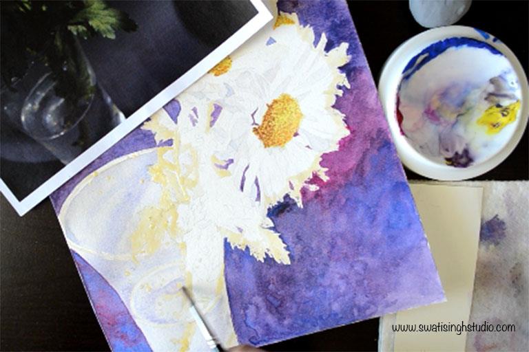
Step 4. Add the shadows falling on the vase in a slightly darker shade of gray. We are doing this quickly while the sheet is still wet. This helps in getting a seamless finish.
Step 5. Let’s build the layers! Below you can see how I proceeded with 12 layers of color! I started by darkening the shadows and then adding two or three layers of the mid values to the rest of the glass.
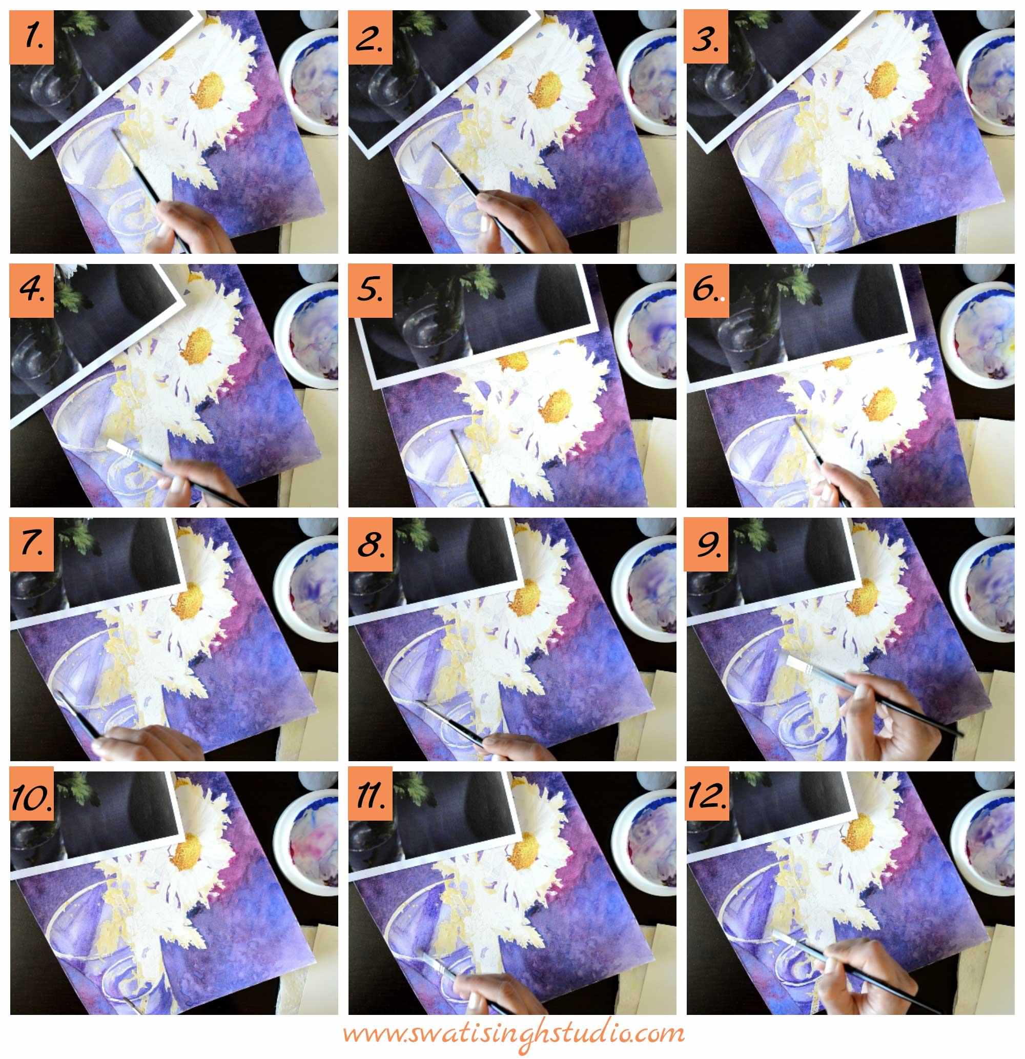
Some useful tips:
a. Soften any hard lines with the help of a brush dipped in clear water. Simply lift off color at the edges.
b. Add a touch of permanent rose to suggest the background color showing through the glass. (layer 10)
c. Follow the shape of the vase to suggest roundness. (layer 3)
d. Work around the rim of the vase carefully with a fine brush such as a #1 brush. (layer 6)
Step 6. Once the sheet is completely dry remove the masking fluid. Run your fingers over the sheet to check for any areas that you might have missed removing.
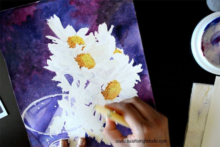
And we are done!
Creating the background was the most satisfying and creative part in the series so far! I hope you will try creating some backgrounds of your own this weekend. I will be waiting to see your lovely backgrounds hence do not forget to share your progress via e-mail or Facebook.
The composition is almost done. In the next part I will cover the following:
a. How to paint the greens in the composition and
b. How to complete the painting with some finishing touches (this step makes the whole difference!)
If you liked this tutorial do not forget to subscribeSUBSCRIBE to my blog and don’t forget to visit my Youtube channel for a speed up video!
Have a wonderful day!
Swati