Hi, lovely artists! Welcome back.
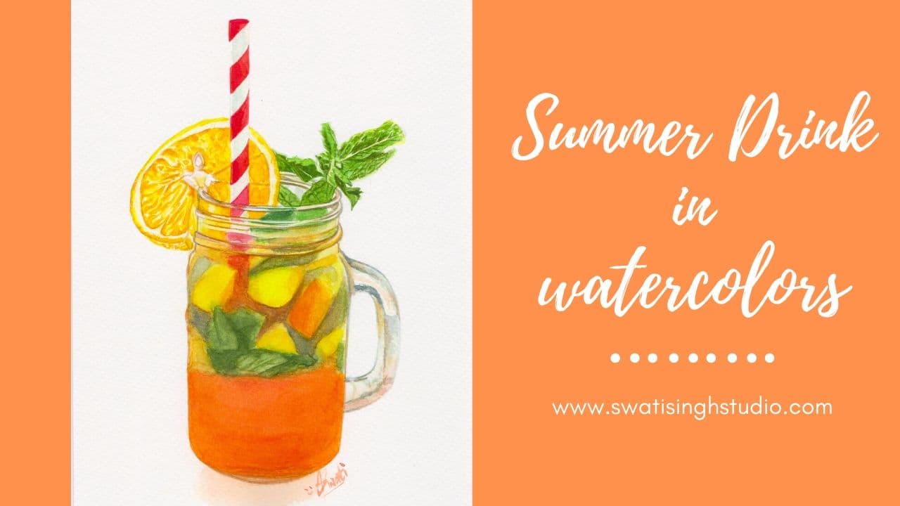
Let’s welcome summer with this cool drink made up of orange juice and pineapple juice. Well, we are not going to drink this but rather paint it. I know, too mean right. Well feel free to actually make one for yourself and drink in this summer heat. What is a better way to welcome this season than to have a cool tangy drink.
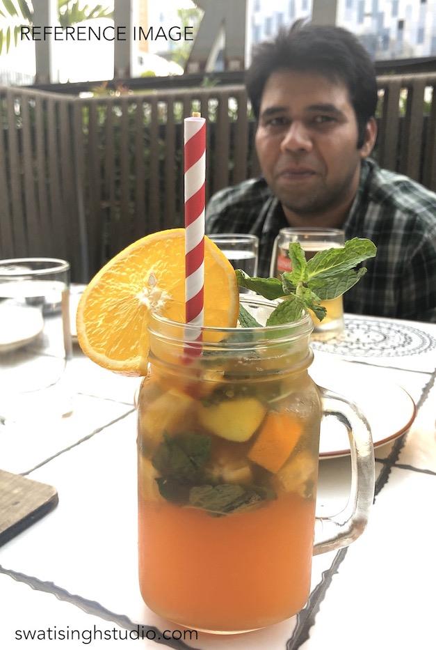
This lockdown has been quite long. This picture is actually months old when I and my darling hubby went to our regular eating joint one evening after a tiring day of work.
I really loved the various colors and decided to paint it one day. Well, finally the time has come!
Let’s take a look at the list of watercolors I used in this tutorial
I am using the same Camel watercolor cakes as I did in my last Orange tutorial.
A. For orange slice
- Lemon Yellow
- Gamboge hue
- Orange
- Yellow ochre
B. For straw
- Scarlet red
- Crimson red
C. For mint
- Lemon yellow
- Sap green
- Viridian hue
- Ultramarine blue
D. For glass jar
- All the colors mentioned above along with
- Burnt umber
- Raw umber
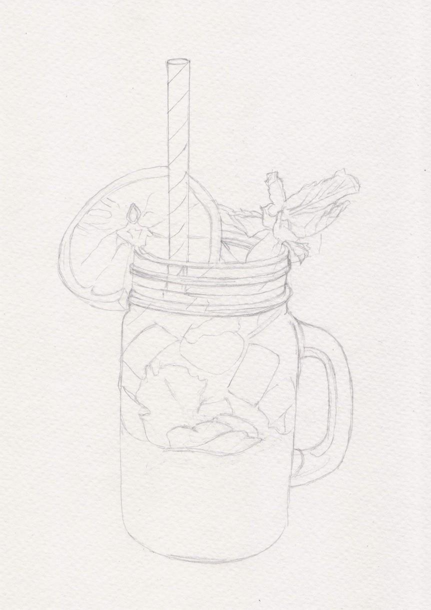
Drawing:
The Method:
PART A- Orange slice
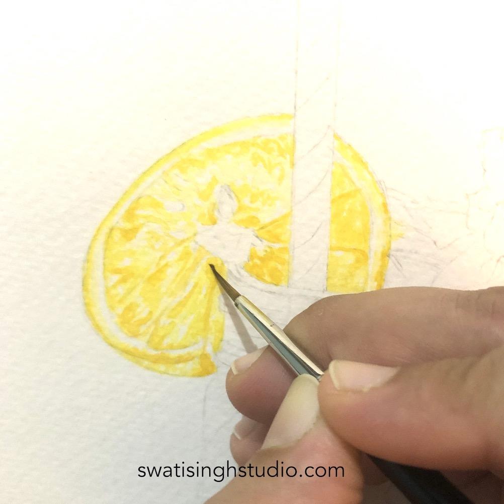
Step 1- Apply a very pale layer of lemon yellow to the slice of orange using a very fine brush. Literally draw the texture you observe on the slice. Make sure to leave out any highlight areas you see shining on the fruit.
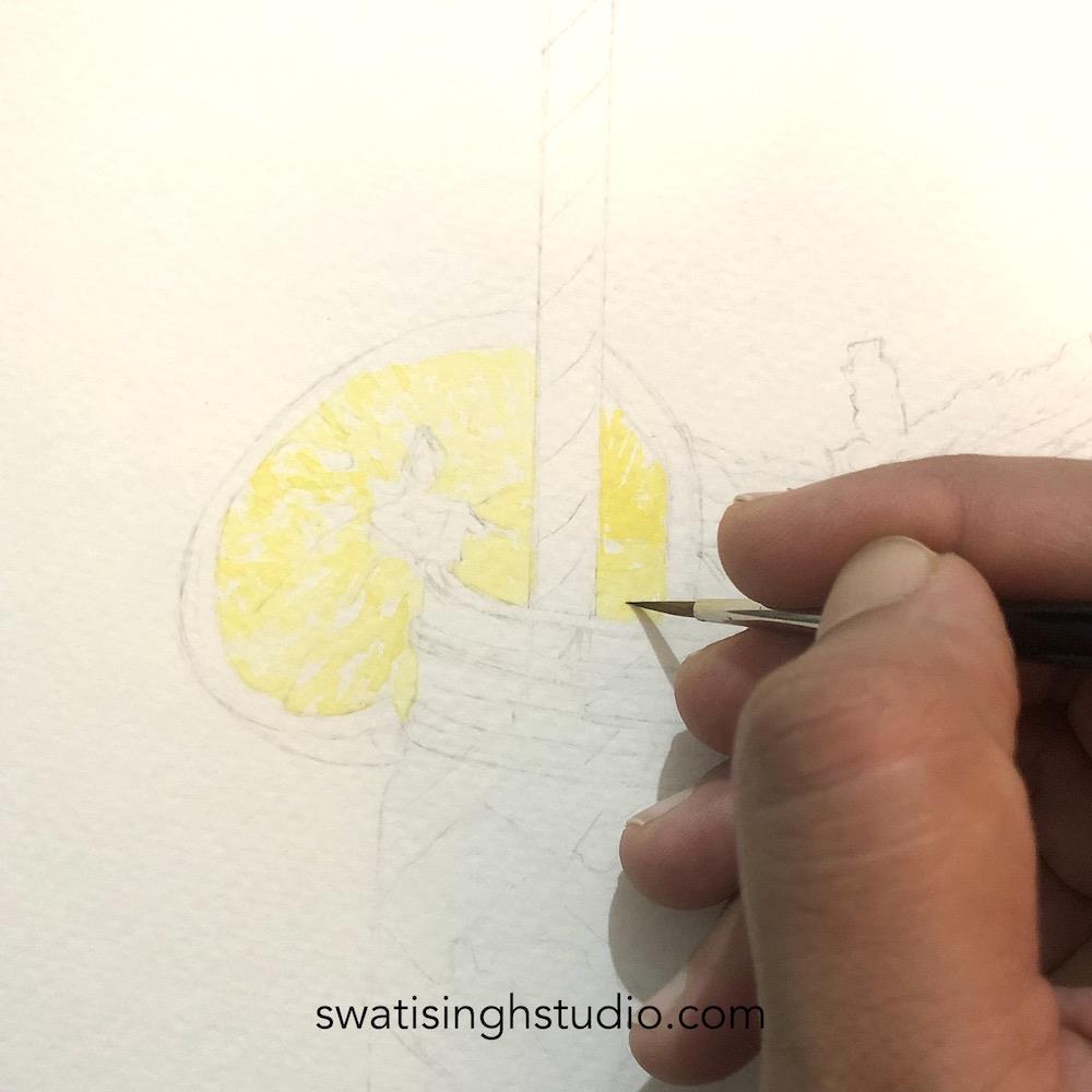
Step 2- Now mix some Gamboge Yellow with a little amount of orange and apply to the darker areas.
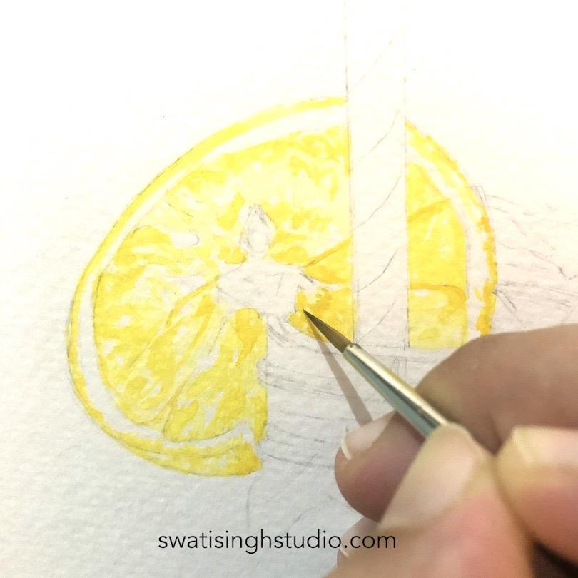
Step 3- Make sure to leave the centre part free of this color.
PART B- The straw
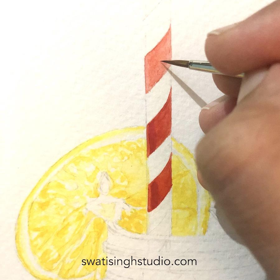
Step 1- For the red parts of the straw apply scarlet red very carefully keeping the lines clean. You will surely need the thinnest brush you have available for this application. I kept the consistency thick since it requires a strong color in the area.
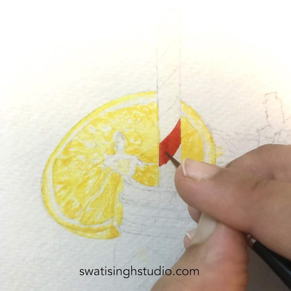
Step 2- Now add crimson red on the left side where the shadow lies. This give it a 3D effect. Make sure to start by leaving some area on the left.
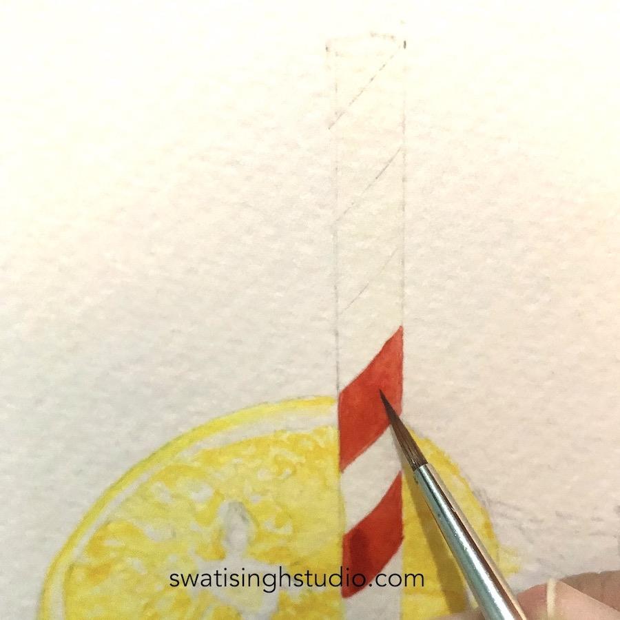
Step 3- If you do feel that the colour might not come even, then another approach is to work in layers. As you can see below, I started by applying a very thin layer of scarlet red in the first layer and then gradually added some more layers on top of it. Make sure you wait for the previous layer to dry completely before applying any more color.
PART C- Mint leaves
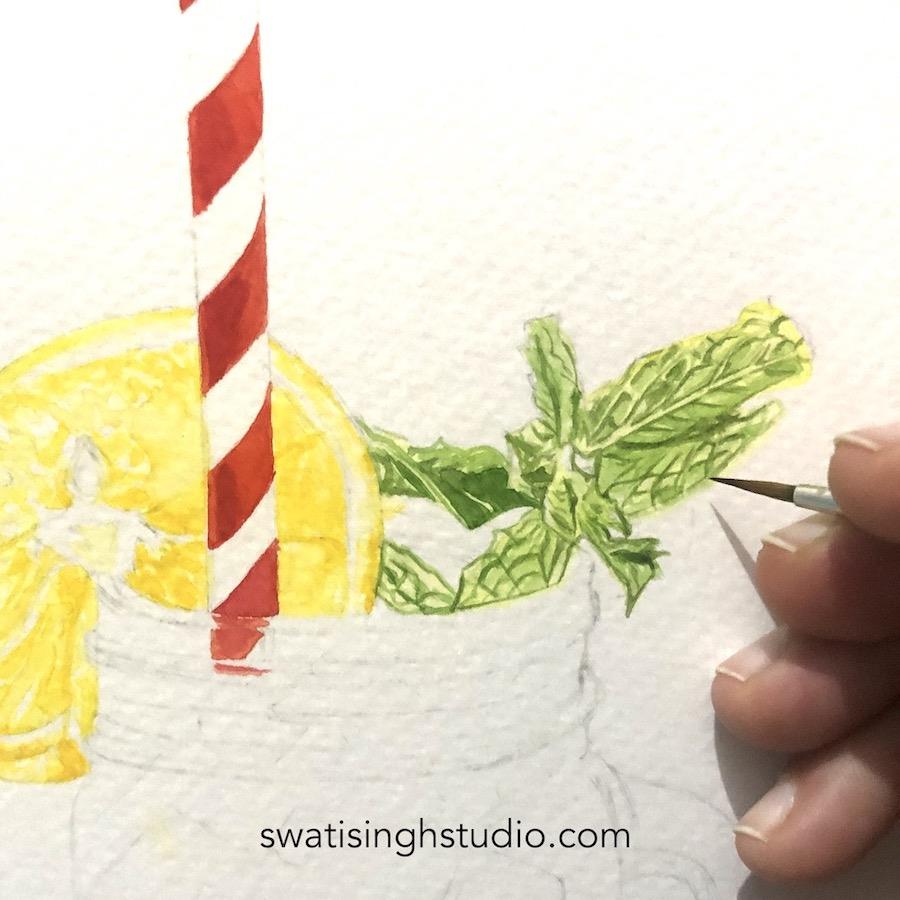
Step 1- Add a very pale layer of lemon yellow to the whole area of mint leaves.
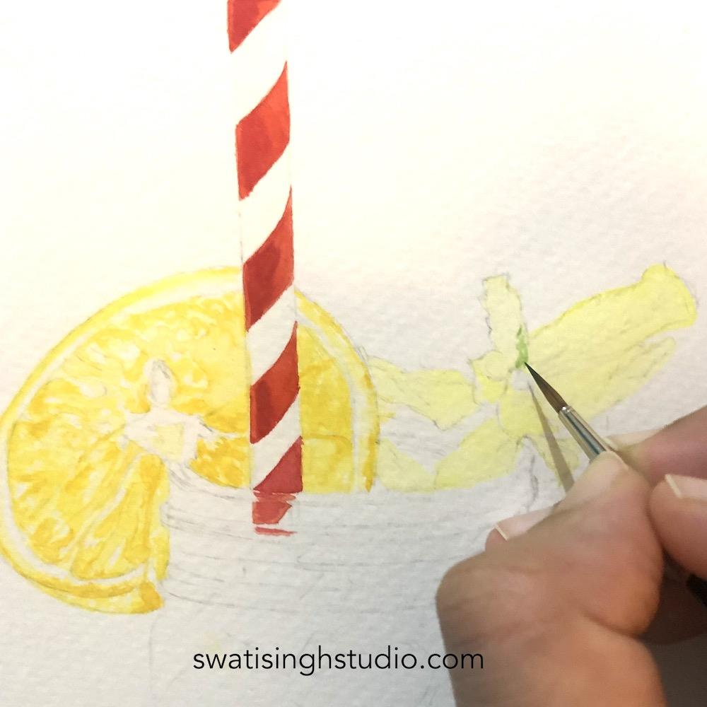
Step 2- Dilute some sap green and with your thin brush start drawing the pattern of the leaves over the previous layer. Draw the veins and also the green shades you see on the leaves. Dilute the color enough to just get a hint of green. Make sure the previous layer is completely dry before adding any green on top or else they will mix into each other and you won’t be able to get crisp lines.
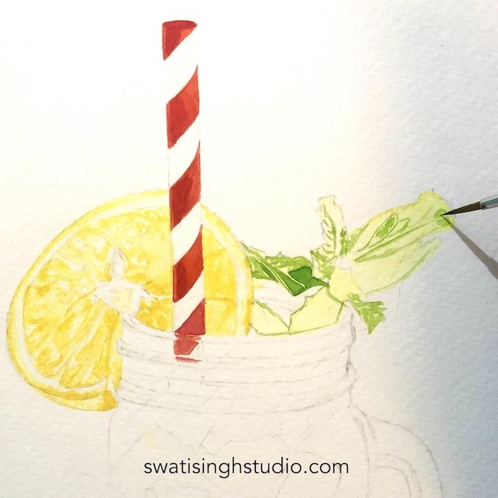
Step 3- Mix just a tiny amount of ultramarine blue and viridian hue to sap green to get a darker shade of green for shadow areas. Make sure to be careful while adding viridian hue since it is a very strong pigment. A little goes a long way.
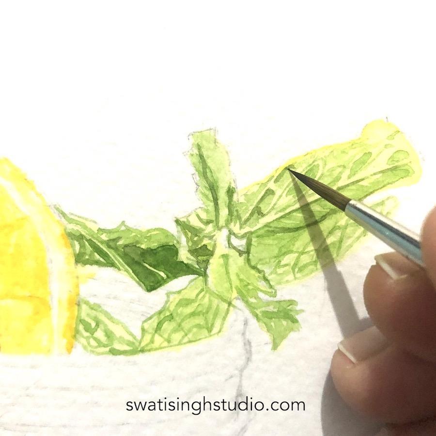
Step 4- Now mix a darker shade of green by adding some more ultramarine blue to the previous shade. Apply this to the veins area for a contrast. Once the veins get dried you may go back and add some sap green to the leaves body to get a more saturated color.
PART D- The glass jar
Painting the glass jar is a little complex since we have so many different shades of color visible through it. Observing these shades one by one and mentally making note of the colors required will make the job easier.
Also, since the jar is made up of glass anything you see through it will be visible but it will be a little low in saturation. We know that thick glass makes thing look hazy hence, we need to keep this character of glass work here.
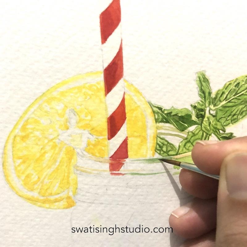
Step 1- Here I am focusing on the rim of the jar where I can see the green of mint showing through. Notice how I have kept the sap green quite diluted since it is behind the glass. It can never match the saturation level of leaves seen outside.
It is very important to protect the highlight areas of the rim. Make sure to use a fine brush for the details in this area.
Proceed on the left side of the rim with lemon yellow colour.
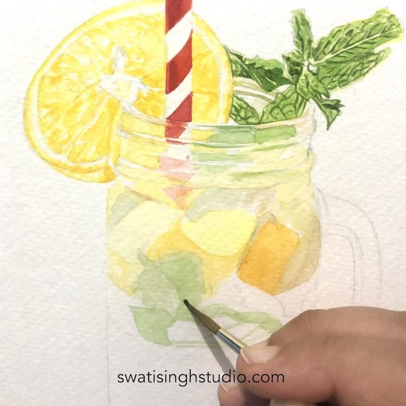
Step 2- Now comes the busy interior! Don’t be intimidated by the mix of so many colors. Simply apply a layer of clear water with a clean brush on the jar. Now start adding very pale layer of colors. For lemon chunks use lemon yellow.
For orange chunks mix in some orange color to lemon yellow.
Sap green for mint leaves.
For dark brown water visible on the sides we need to incorporate two new colors here: Burnt umber and raw umber. Try and test out different shades in rough by mixing tiny amounts of these colors in green or yellow.
For orange juice- make sure to add a fresh layer of clear water first. And start dropping in orange in generous amount. We do not want to add many layers in this area since getting a smooth finish will be difficult if we overwork this.
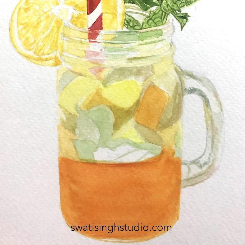
Step 3- Moving on to the handle. Again there are many colours. But mostly it is grays and browns. So for blue areas use ultramarine blue mixed with just a hint of sap green. And for brown go for raw umber.
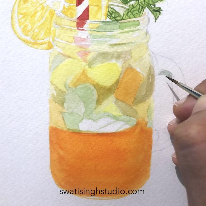
This is how it looks after adding all the shades of browns and blues.
PART E- Finishing touches
Step 1- I finished the edges of orange slice with some yellow ochre. Outline the seeds in the centre with the same colour.
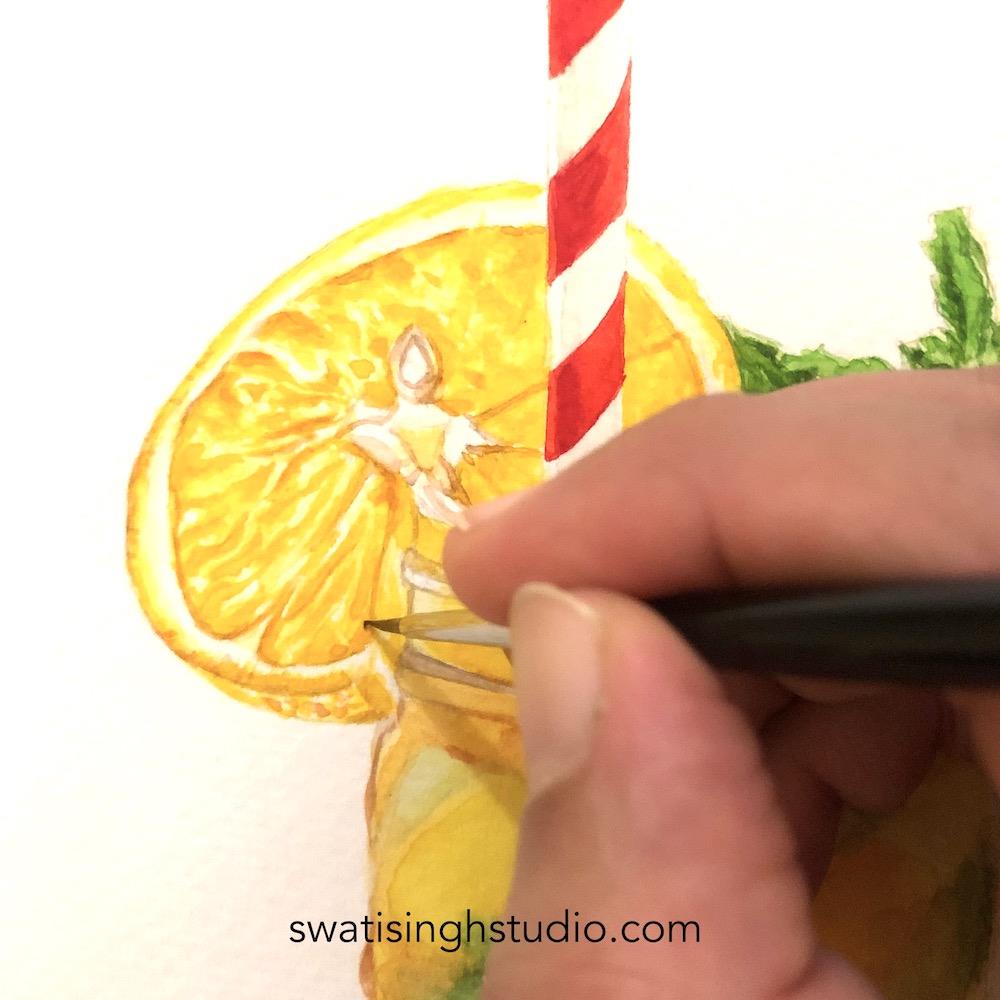
Step 2- Going back to the rim. There are some really strong dark lines visible. Hence, I darkened these lines with a fine brush.
Also for the white areas on the straw I added just a tiny amount of ultramarine blue on the left side. Keeping the rest untouched. This gives it some roundness.
Can you guess what went wrong in the straw?
I painted red on white and white on red! Lol. I had to adjust the straw colors inside the jar accordingly.
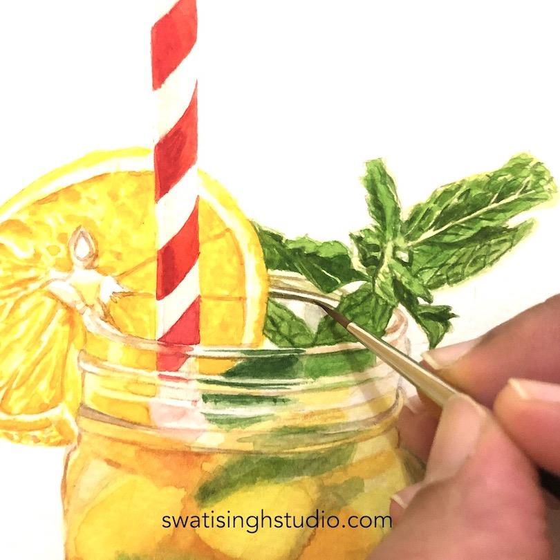
Step 3- Here you can see what a difference this step makes! It makes the highlights stand out even more.
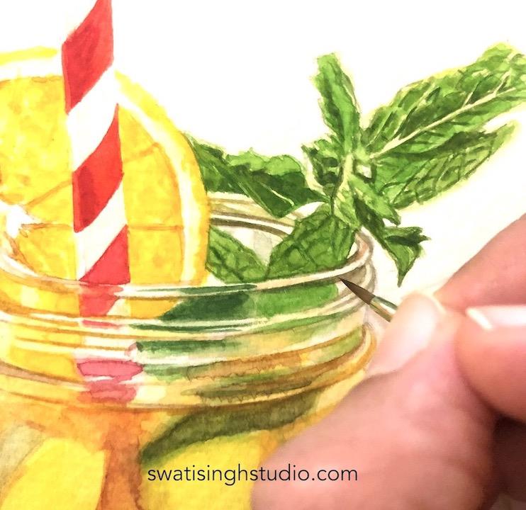
Final look: After adding some more layers of color wherever I felt it needed higher saturation this is how it looks!
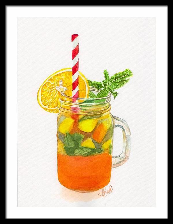
Painting this glass of beauty truly put me in summer mood. I simply love the orange colour against the bright green of the mint. The subject is definitely complex to work on but I am sure following the above method you will be able to get good results.
Feel free to ask me any questions regarding this tutorial if you feel you are stuck somewhere. I will be more than happy to answer. I simply love reading your emails and looking at your shared artworks.
So here I am signing off with the promise to bring another fun tutorial for you guys very soon.
Till then stay safe and happy painting!
Swati