
Welcome back everyone! Finally, we have a spring weekend for real this time. 20th March is officially the first day of spring season. So how are you all preparing for this lovely time of the year?
Last weekend me and my husband sowed some tomato and flower seeds. Let’s hope to see them sprout soon. After all gardening is one of the most beautiful ways to celebrate the spring season.
Today, I have a watercolor tutorial on cherry blossoms. By the way, cherry blossoms will be at its peak on March 23-24. If you are near Washington DC, do check them out along the Tidal basin.
Below is a picture I took last year during this festival.
The close-up view shows all the delicate details of the flower petals. The petals are very delicate and translucent which adds some interesting shadows. Some petals also show the blue of the sky.
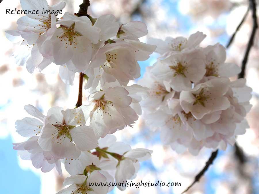
We do not require a lot of paint to achieve this look. In fact, we need to be careful while applying the washes as to not make them look opaque.
If you are new to the “Spring” series kindly refer to this POST for all the details and the required materials.
The watercolors I used in this tutorial are
1. Cobalt blue
2. Lemon yellow
3. Permanent rose
4. Olive green (You may also use sap green instead)
5. Burnt sienna
6. Burnt umber
So let’s get started!
The drawing is done in HB pencil. I did not draw the veins on the petals as we don’t want the pencil lines to show through the thin washes. Also, keep the drawing very light in tone.
Step 1. We need to start by mixing some lemon yellow, ultramarine blue and permanent rose to form a gray color as shown below.
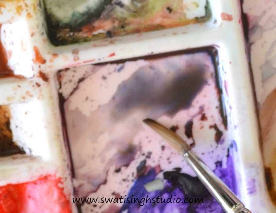
If you carefully observe different shadow areas in the petals, you will find that they are not all the same. Some grays are more pinkish while some are more bluish or yellowish.
Hence, explore different mixes of the above colors to get different grays. It is always better to try the shades on a rough watercolor sheet before applying to the drawing. Below you can take a look at my rough color blocks.
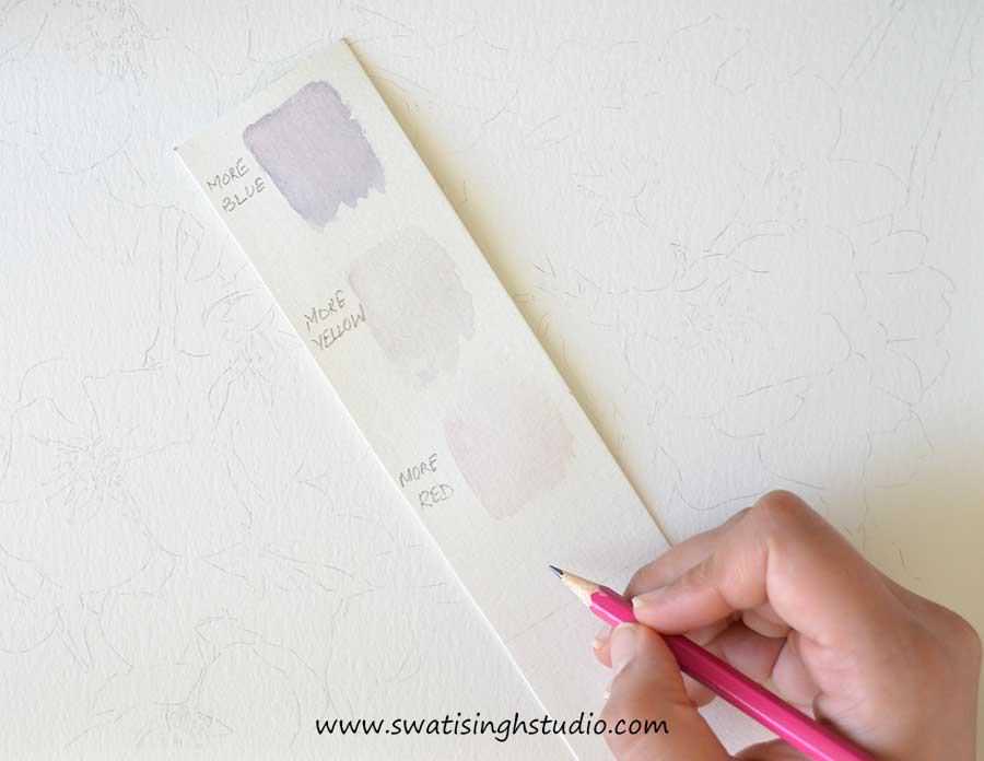
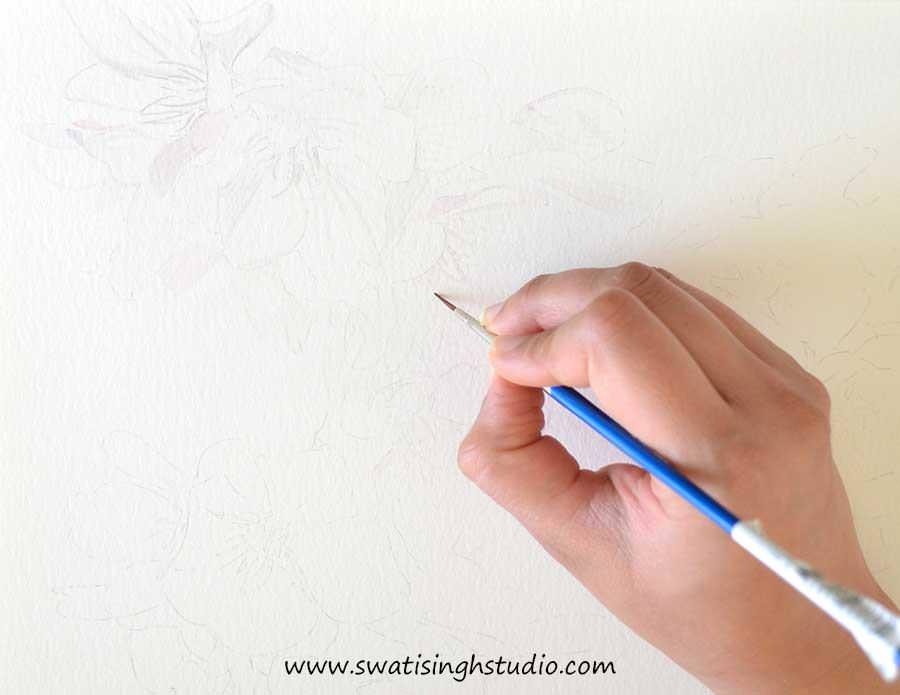
Step2. Now with our grays ready, it is time to paint the fine veins of the petals using a very thin brush. I am using a number 1 brush.
Important: It is very important to keep the color diluted as we do not want any harsh lines to show. These veins are hardly visible from a distance. Hence, keep them subtle as shown below.
Step 3. Now it’s time to add some shadows. I am using a number 5 round brush here. Keep varying your grays as required with more of red or blue and give a very light wash to the petals. Also, add a little touch of permanent rose wherever you see pink color.
Tip: Keeping a blank sheet of paper under your hand will help in keeping the sheet neat and tidy while painting.
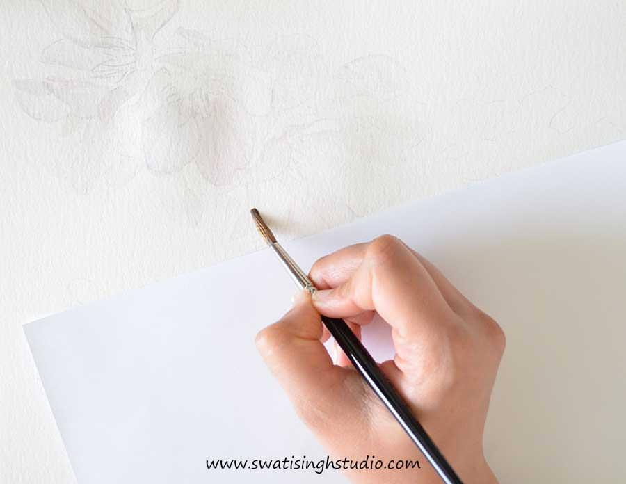
Step 4. Give a light glaze of olive green to the green centers of the flowers and burnt sienna to the stems.
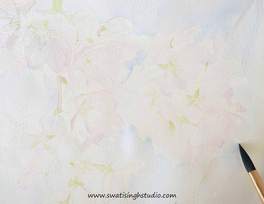
The pencil lines are very light in tone and we do not want to get confused while painting. This step will help in blocking out the various parts of the flowers for better clarity.
Step 5. Add another layer of shadows to the petals as shown below.
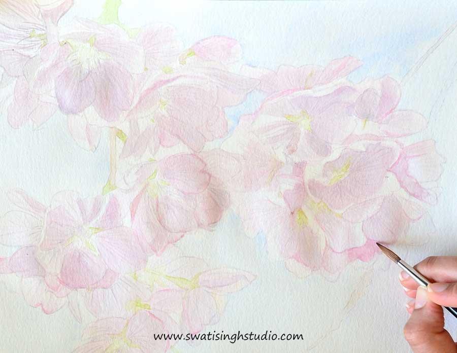
Step 6. Darken the stems by applying a slightly thicker layer of burnt sienna.
Then add burnt umber to the shadows of the stem.
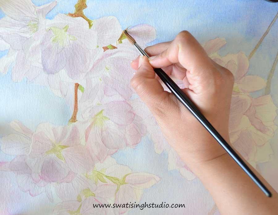
Step 7. Keep repeating the above steps till you achieve the right saturation of colors.
Finally, add fine details like stamen (in burnt sienna, burnt umber) and petal outlines (in gray) using a number 1 brush. This will help the flowers get a crisper look.
I also added a touch of permanent rose here and there to make them pinker.
And the cherry blossoms are ready!

Although the flowers were a bit tricky to paint, the contrasting background made the light flowers come out beautifully.
I really look forward to seeing your cherry blossoms too. You may share your sketches with me on Facebook! You may also SUBSCRIBE to my blog to stay updated on future tutorials.
I will be here next Saturday with yet another flower in the “Spring” series.
Till then enjoy painting in watercolors!
Swati